Magnifying Warhol’s Work – The design process behind the Absolut Warhol bottle
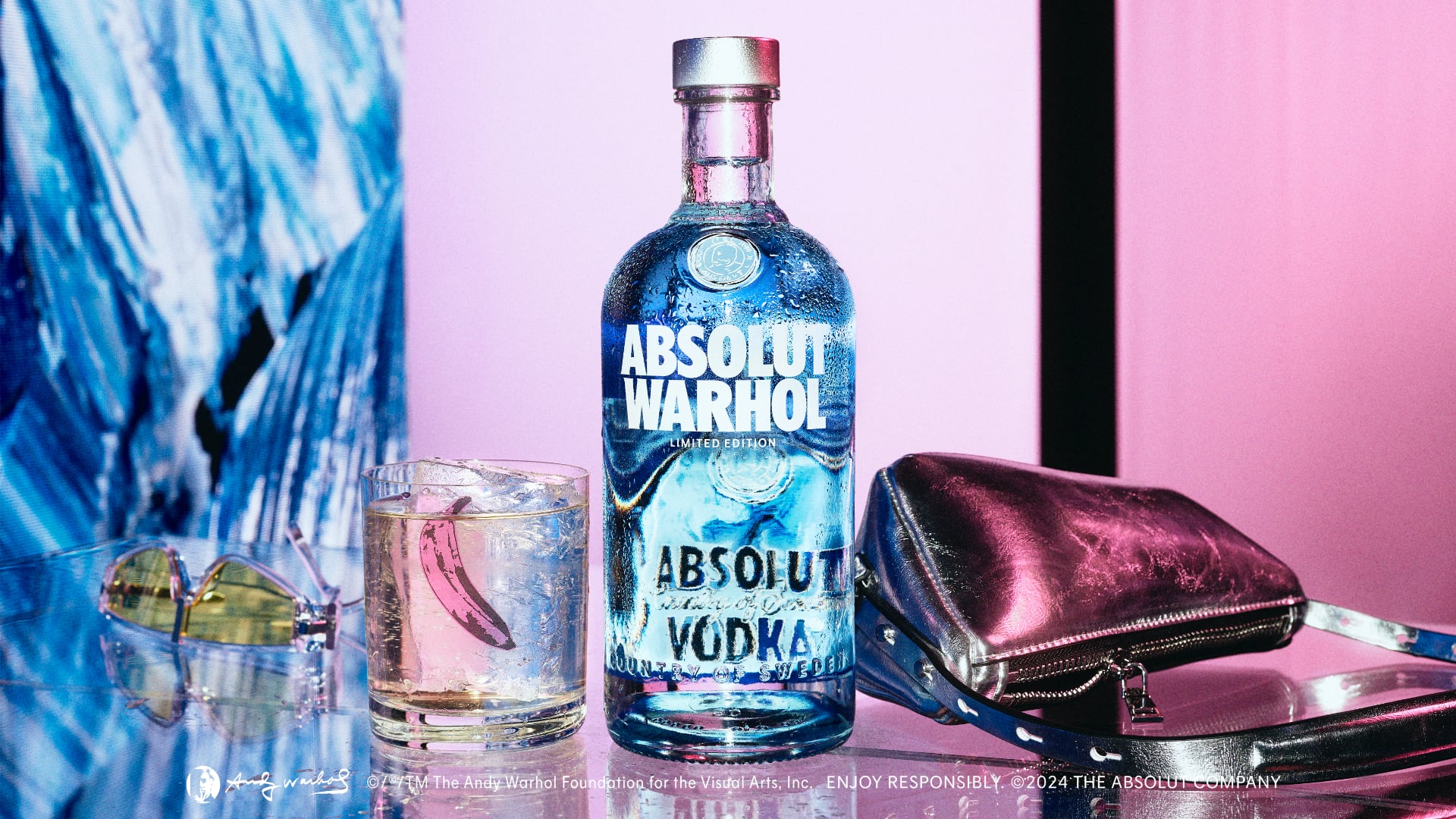
The limited-edition Absolut Warhol bottle released this summer interprets an original Andy Warhol painting that was commissioned for Absolut almost 40 years ago.
The development of the unique bottle required creativity, boldness, and years of careful planning. Gavin Boland, Marketing Manager Innovation, led the design for Absolut. In this interview, he shares his experiences working on the design and gives an insight into what the project meant to him personally.
Before we dig into the design process, let’s quickly go through the backstory. In 1985, Andy Warhol was the first artist to create artwork based on the iconic Absolut bottle’s silhouette. His original ‘Absolut Warhol’ piece – an Absolut bottle painted with vibrant colors on a black background – has since become one of the artist’s most famous works of art – and one of Absolut’s most successful marketing campaigns.
For decades, it was rumored that a second Absolut Warhol existed. It remained unconfirmed until recently when a blue Absolut Warhol painting was rediscovered at an auction in 2020. With the original contract as proof, it was soon confirmed that two original paintings had indeed been commissioned in the 1980s. Thus, the ‘lost’ Warhol had been found.
We reminded ourselves of the fact that Andy made this painting for Absolut, and that it was to be the key point of the bottle.
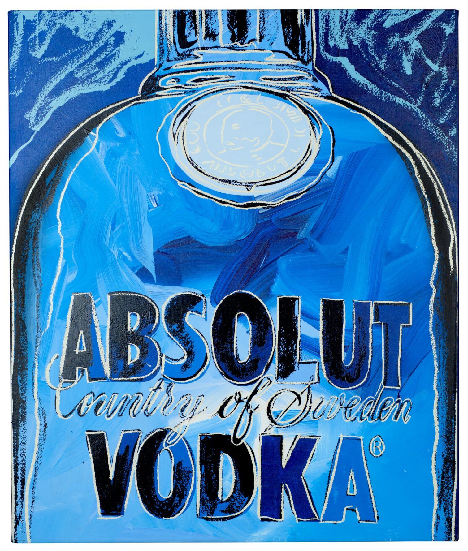
That very painting, which renders the iconic Absolut bottle in numerous shades of blue and off-white colors, is what Gavin, the Absolut team, the design agency Brand Union, and glass bottle manufacturer Ardagh have sought to bring to life with the new limited-edition bottle.
Their work began in a secret location, somewhere in Stockholm, where the painting has been kept ever since its rediscovery.
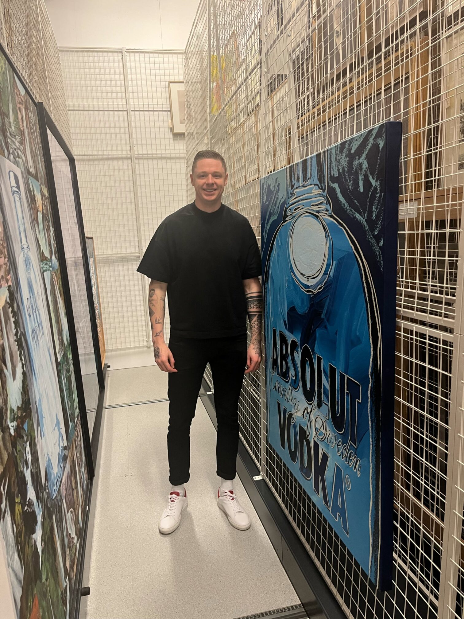
“I was one of the first, if not the first, person from Absolut to see the painting in real life”, says Gavin about his visit to Spritmuseum’s secret archive safe. “It was incredible. The blues in the painting were as bright as ever. It still looks brand new, because it’s been wrapped up inside a tube and basically never been exposed to light”.
Gavin’s immediate thought was how he would be able to capture the bright blue colors. “He used so many different blue colors and layered them in such a ‘Warhol esthetic’, combining brush strokes and screen print, one after the other. “It’s a beautiful painting, so you really want to do it justice.”
To capture the vivid blue colors, Gavin had brought high-level camera equipment, which he used to take in-depth photos and videos of the painting. This way, he could extract the exact blues and off-whites used by Andy in the 1980s.
The process didn’t start in the archives, however. Before seeing the painting up close, Gavin and his colleagues first had to convince the Warhol Foundation for the Visual Arts, responsible for protecting and enhancing its founder’s creative legacy, of the idea. After working closely with their representatives in New York, with flights back and forth for both teams, they agreed on how the painting would best be brought to life.
“We reminded ourselves of the fact that Andy made this painting for Absolut, and that it was to be the key point of the bottle. It’s all about the painting, so that needs to be front and center. That also means the bottle cannot stray too far from the original piece, so while you can add nice contemporary details and really nice decoration pieces, the painting needs to be there for everyone to see.”
So, your guiding question was, ‘What would Andy have done?’
“Exactly. He was someone who always pushed the boundaries and tried new mediums. Naturally, we asked ourselves what he would do if he were to screen print a bottle in 2024”.
Screen printing is the technique Absolut uses to print its bottles and one that Warhol was also known for using in his artistry. Not least in the recently rediscovered painting, where he combined screen printing with painted brush strokes in numerous blue and off-white colors.
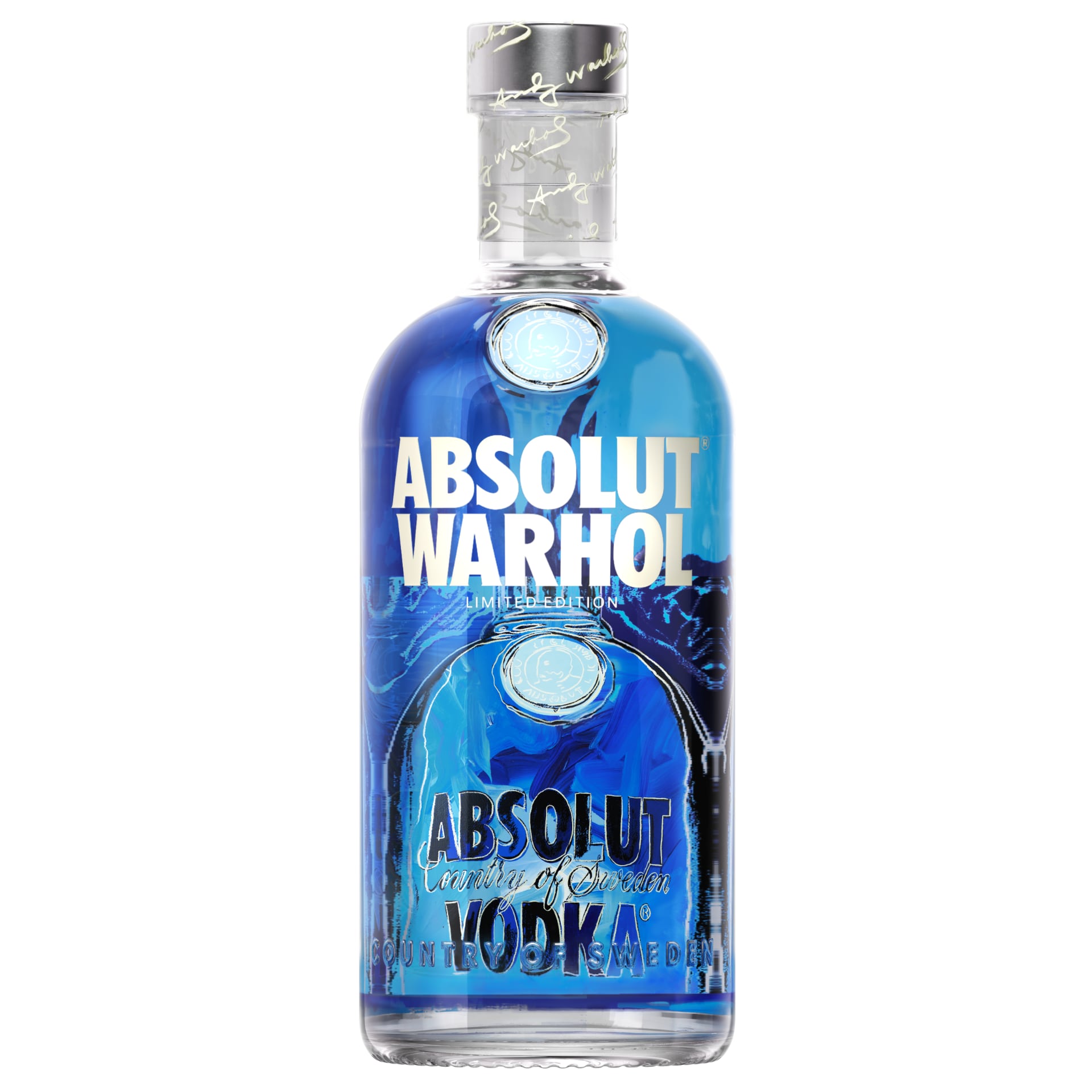
“We wanted to explore whether we could layer these very complex screens and brush strokes on the back of the bottle using a ceramic ink. We could have decided to print the painting on the front of the bottle, but that way it would have looked relatively small. To really bring it to life, we made the decision to print it on the back so that the liquid inside the bottle magnifies the painting.”
The result is a beautiful, captivating and vibrant blue bottle. From each perspective, new elements appear, framing and enhancing the original painting.
”The whole idea with the Warhol bottle is that, as you pick it up, turn it and explore it, you’ll discover something new every time. From each angle, there’s something for both fans of Absolut and Warhol. It’s a bottle with a lot to offer, rather than an ordinary bottle on the shelf.”, says Gavin.
For Gavin, working on the design of the Absolut Warhol bottle has been important not only on a professional level but also personally. Having grown up in Ireland, in a family where art was always present, he says Warhol was always someone he looked up to.
“I even have tattoos of his work and of other famous artists like Van Gogh and Banksy. I’ve had them since before I joined Absolut, so when this project came up, I pushed myself forward to get the opportunity to lead the bottle element of it and was so lucky to be entrusted with it. It’s a huge privilege and the highlight of my career.”
His most memorable moments have been the visits to New York City for meetings with the Warhol Foundation in their head office.
“There are Warhol’s hanging on every wall. Even as you’re walking to the restrooms. There’s literally inspiration everywhere you look.”
Gavin recalls one encounter with ‘the Foundation’ (as he now refers to them) that stands out. This was when Gavin and the core project team presented the first design of the bottle.
“They really thought we had ‘pushed’ the design to new heights and new levels. That meant a lot, because we all believe that’s what we have achieved. There’s stuff here that hasn’t been done before with Absolut. It was great seeing their reaction in person.”
You must have been nervous.
“Very nervous. There are lots of stakeholders, not least outside of the [Absolut] Company, such as fans and thousands of really avid collectors. You also want to deliver something that they really want to collect. It’s cool to think that even after people have enjoyed their vodka, they will want to keep the bottle. It’s like a piece of art you can take home for a really good price”.
What’s your view on the Warhol and Absolut connection, and how important has it been in this project?
“There is a true heritage between Absolut and Warhol. Andy was truly a fan of Absolut. He loved the iconic shape of the bottle and really wanted to bring it to life with his paintings. That’s the joy of working with Absolut and it’s something other brands can only dream about. That’s why this is not just another collaboration. This is true, artistic and authentic. And there’s a lot there for fans, collectors and art lovers.”